Join Artist and Tutor Linda Birch as she hosts Higham’s Art Club. Linda will set a weekly observation for you to participate in and if you wish you can share your creations with us and receive feedback from Linda. Please share your work with us by emailing social@highamhall.com or tag us via Facebook, Instagram and Twitter pages.

WEEK TWELVE:

Self portrait in a mask
Medium: charcoal or ink
Please send your entries in by Wednesday 12th May to social@highamhall.co.uk

Amanda Dyer – Meg Keeble – Joan Loxton – Bob James – Jean Rosswear – Joan Middleton – Gordon Clark – Richard Comrie – Jaci Cowan

WEEK ELEVEN:

A cd cover
Peter and the Wolf  Prokofiev
Medium watercolour with ink
Three colours Yellow Red Green (plus black ink)
Please send your entries in by Wednesday 21st April to social@highamhall.co.uk

WEEK TEN:

Two small foil wrapped Easter eggs.
Or, A hard boiled egg with its top off, (sitting in an egg cup if you wish)
Medium: Watercolour or coloured pencil.
TIP Light your subject well in order to get good lights and darks. A desk lamp works well.
Have a Happy Easter!
Please send your entries in by Wednesday 7th April to social@highamhall.co.uk

Linda’s Feedback: 

Hello Everyone

Thanks for all your eggs Easter and boiled!

Those who did the foil wrapped ones managed the sharp changes of colour caused by the creasing,  and the tones on the smoother eggs were handled so the egg looked the dimensional. The boiled eggs were not an easy subject but there was some really good subtle colouring achieved.

WEEK NINE:

Through the Open Door.
 
Make a painting or drawing of this.  Interpretation is up to you. Maybe looking outside, or inside, or even some other meaning the sentence has for you with the easing of Lockdown. 
Use ‘portrait format please 
I AM EXTENDING THE DEADLINE FOR YOU TO NEXT WEEK.
Again my apologies and I look forward to seeing your work  Linda
Please send your entries in by Wednesday 31st March to social@highamhall.co.uk

Linda’s Feedback: 

Hello Everyone
Well, I really enjoyed seeing your entries. There was a really thorough and varied engagement with the subject.
Meg,  yours captured the memories you mentioned of living in such a beautiful setting. Roma’s was truly original in her doorstep Amazon delivery! I liked Sandra’s wistful mouse and the heavenly bodies; while Ian’s take on the subject with broken abstracted door frames worked very well. Bob, you summed up the Lockdown, love the boots!

WEEK EIGHT:

Paint a watercolour landscape using a square format not the usual rectangle.

Please paint to the edges, no empty spaces!

Please send your entries in by Wednesday 17th March to social@highamhall.co.uk

Linda’s Feedback: 

Thank you Everyone for your square pictures, it was interesting to see how you handled  the  compositions in a format that isn’t traditionally landscape shape. It made the pictures more intimate, and there was a stronger feel to the way land shapes lock together. Often the desire is to paint a ‘view’ and deal with all the elements, trees, hills, water etc. but we sometimes lose sight of the way landscape is about shapes and contrasts of tone and colour all  connecting together.

WEEK SEVEN:

Now for something completely different!
A painting of two flowers in a cup.
Watercolour or acrylic.
Please send your entries in by Wednesday 10th March to social@highamhall.co.uk

Linda’s Feedback: 

Thank you for all your paintings you submitted, the standard was very high. What was interesting was the way you interpreted the challenge in different ways. I liked the way some of you used the space around the subject, this is an important part of composition, and creates a dynamic tension within the negative spaces* left around the flowers.

*negative spaces are the spaces outside and between the subject, and are important, If not considered they can make the subject ‘float’ inside the picture plane.

WEEK SIX:

This week’s project concerns The Picturesque Movement. This was an eighteenth century movement promoting a formulaic approach to landscape painting. Rules were laid down as to what made an ideal landscape, and what did not. It sounds constricting, yet the ideas it promoted still influence the elements we  look for in a landscape today that creates, a ‘good view’

Although we don’t follow rules like this these days, yet it is interesting  to explore the rulings laid down regarding the ideal sublime landscape.

So, here it is.

Paint a Landscape

Use oils, acrylics or pastels.

The landscape must contain the following:

A Distance (mountains, hills )

A Middle distance containing any of the following: A building, a group of cattle (odd numbe4s) a stand of trees

A Foreground in shadow.

Please send your entries in by Wednesday 3rd March to social@highamhall.co.uk

Linda’s Feedback: 

Thank to all who sent in artwork. There were some good examples oF far, middle and shadowed foregrounds.
I set the project as you know around the concept of The Picturesque Movement.  Have a look at the following artists work, and you will see how the concept behind a background, the focal interest in the middle distance with a strong shadowed foreground was used in  the work of  Claude Lorraine (1600-1682) and Poussin (1594-1664). This was a deliberate attempt to improve Nature and can also be seen in the work of landscape designers such as Capability Brown  1716 – 1783.

WEEK FIVE:

Still Life in pen and ink.
No colour, but use the pen to create shadows. (tip, use a table lamp to cast light on the arrangement, which creates good shadows, or stand the still life near a window)
Please send your entries in by Wednesday 24th February to social@highamhall.co.uk

Linda’s Feedback: 

Thanks to all who submitted work.There were some interesting approaches to your line work, from the lively  use of line on some onions,  the textural marks on the shells and fir cones, to the pointillist technique used on the succulent plant. I enjoyed the humour in the drawing of the binoculars, they look as though they are looking at you! Some good strong work overall.

WEEK FOUR:

Still Waters.
Depict this any way you wish, it might be a pond,  or a lake, there may reflections, it may be frozen; or a calm sea, becalmed ships.. (The Ancient Mariner   has two lovely lines: ‘idle as a painted ship, upon a painted ocean’) Give it some thought. 
Medium: Watercolour, or line and wash, or paste
Please send your entries in by Wednesday 17th February to social@highamhall.co.uk

Linda’s Feedback: 

Thanks to all of you who contributed to ‘Still Waters’. I had an enjoyable  look through, them all. The styles are all different, as they should be, and I was struck by the richness of colour in some, with the almost minimalist depictions in others  while the tonal painting in blue holds together beautifully. I realise that you all have different levels of painting experience, so the only thing I would advise, is that keeping the water level on the distant shore dead straight will keep the water from running downhill,

WEEK THREE:

A Chicken.
You may treat this as you wish in any medium! Please be aware that you mustn’t copy another artists work.
Enjoy!
Please send your entries in by Wednesday 10th February to social@highamhall.co.uk

Linda’s Feedback: 

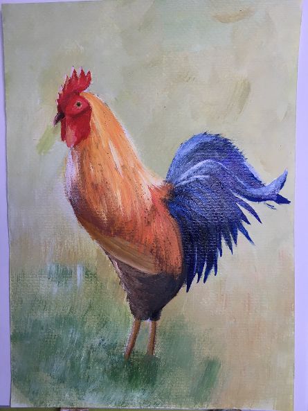
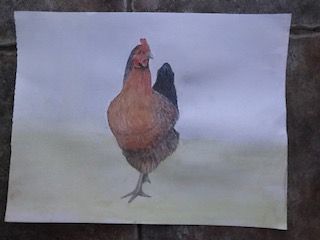
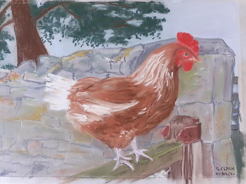
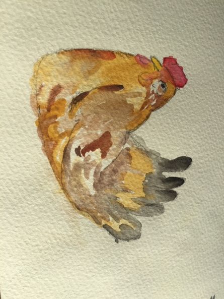
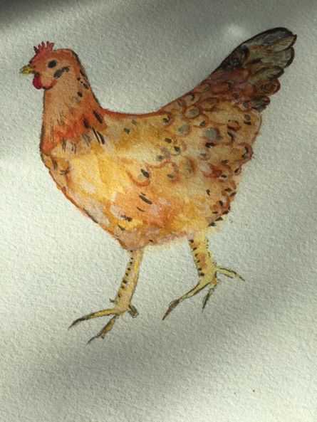
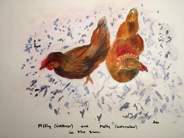
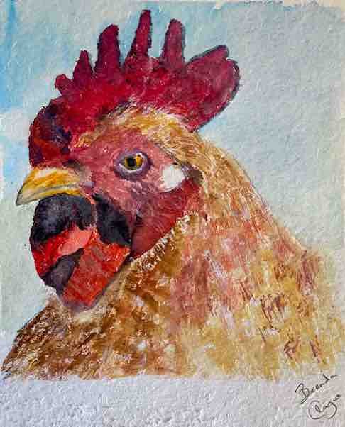
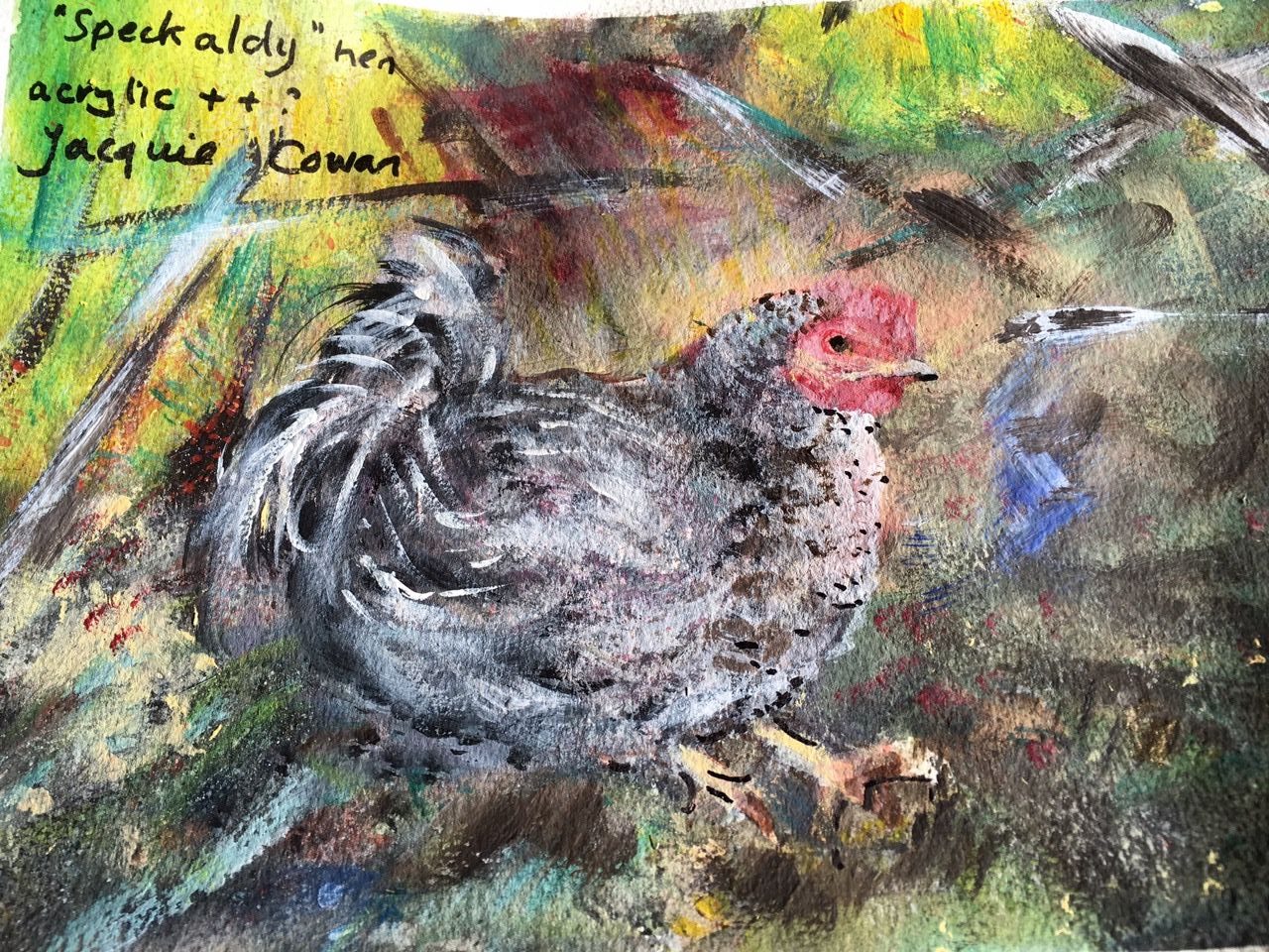
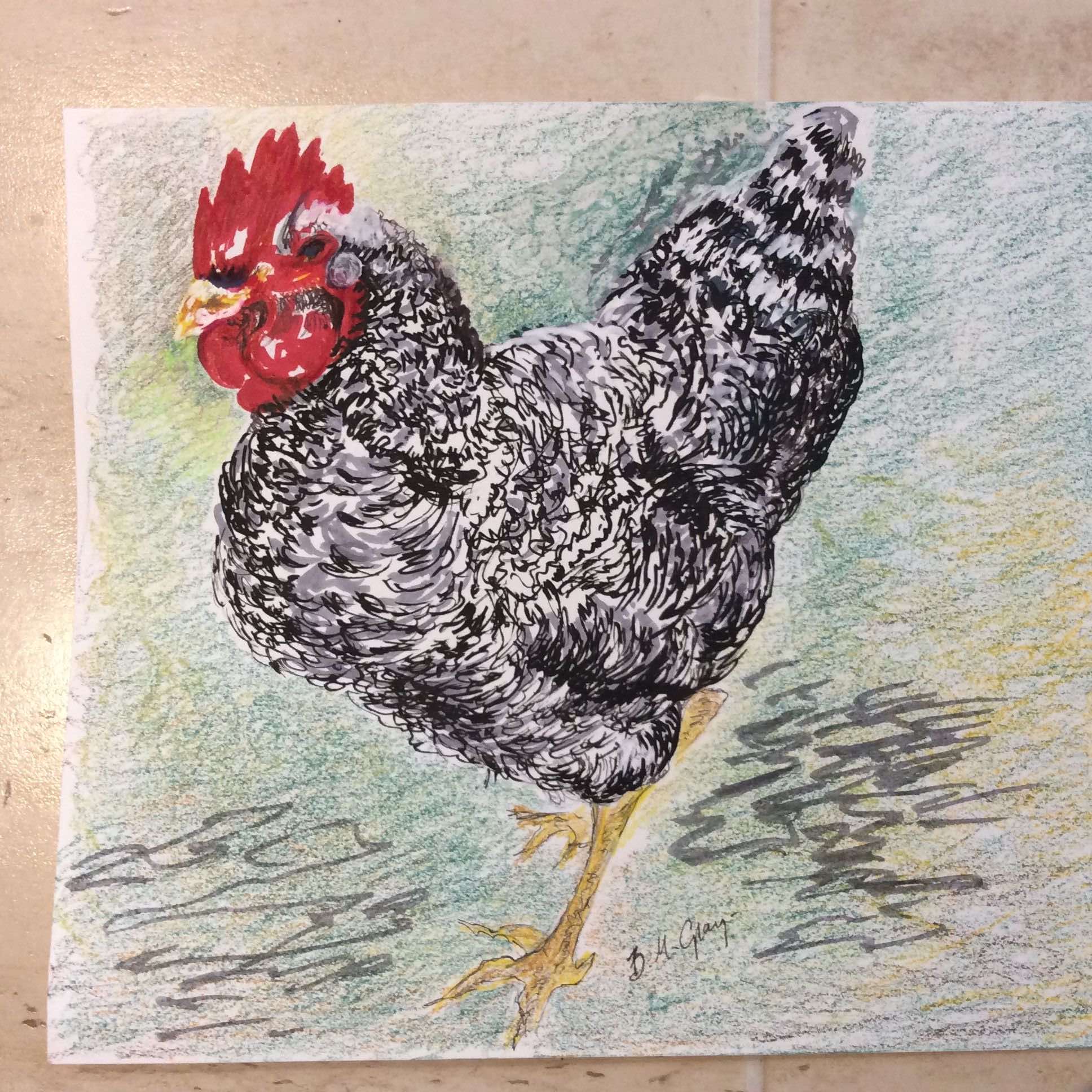
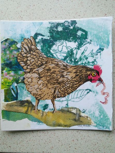
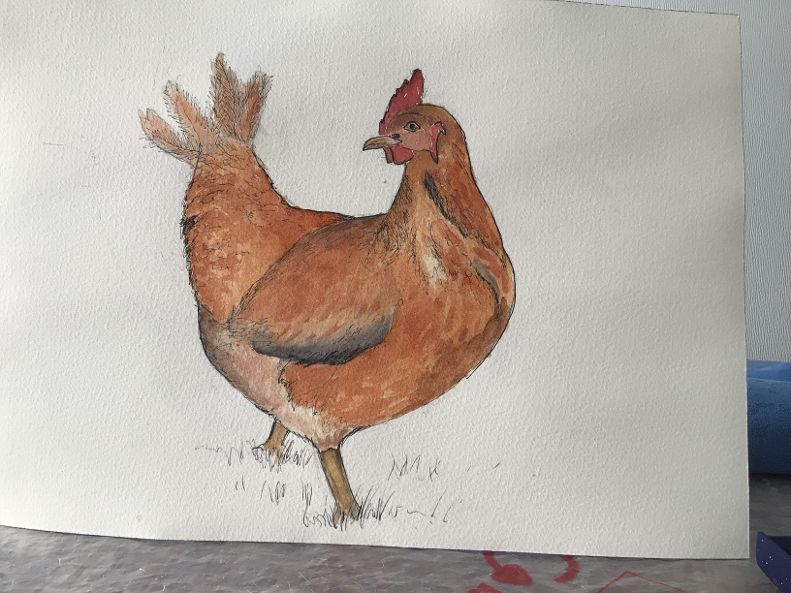
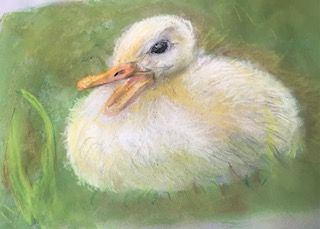
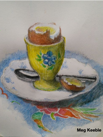
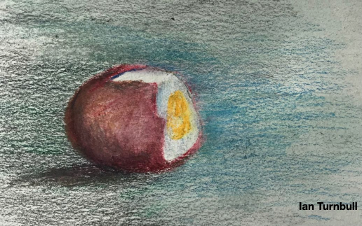
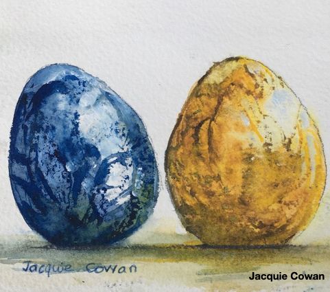
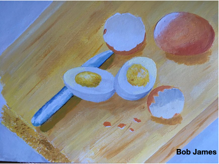
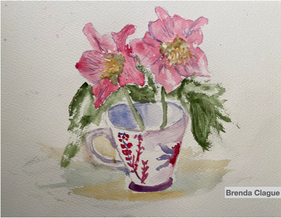
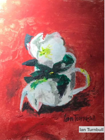
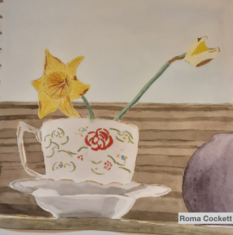
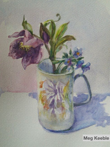
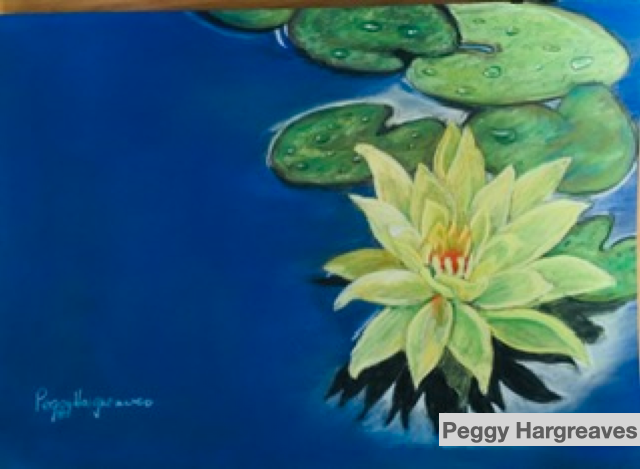
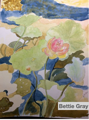
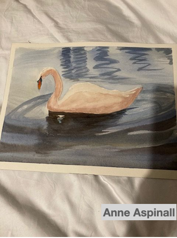
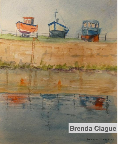
What a colourful lively collection of chickens! Thanks to you all.
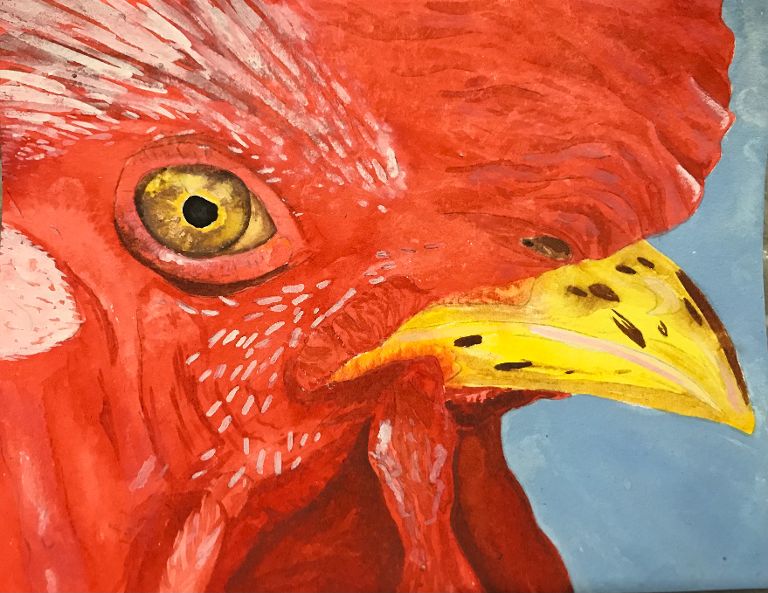
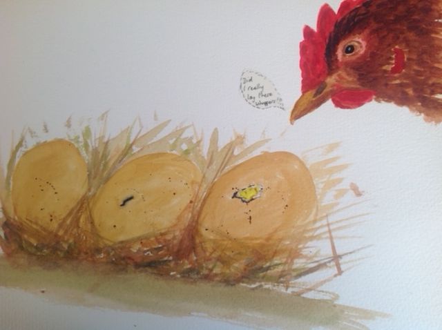
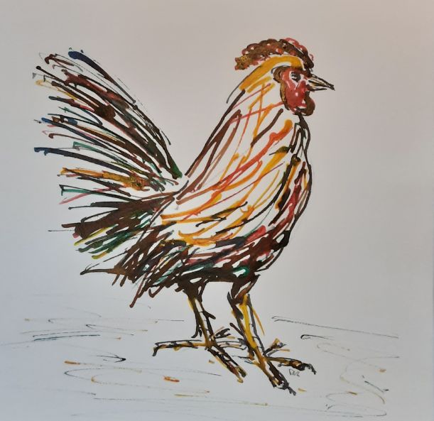
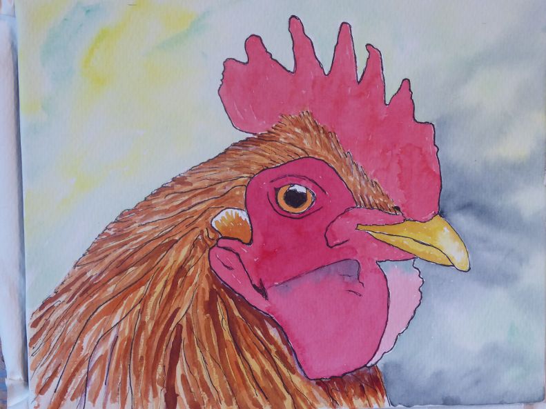
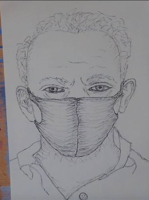
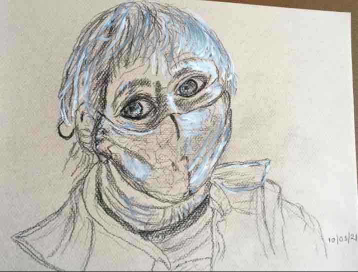
When you get a subject like this, think about it for a bit. What is it about chickens that can describe them best? Is it their colours  their character, their patterning? And which quality do you want to emphasise? As artists it is not merely about depiction that we need to pay attention to, but to bring out the qualities of a subject that we want to express. In the case of  a chicken that may be colour, or character or movement. This means you may not have to depict the whole chicken, so the heads work very well for character, and maybe the colourful patterning might work well if it was stylised, someone brought out the humour of chickens….all things to think about.

Amanda Dyer – Anna Tierney – Anne Aspinall – Roma Cockett – Richard Comrie – Bob James – Christine Hayes – Gordon Clark – Jean Roswear – Joan Loxton – Joan Middleton – Meg Keeble – Bettie Gray – Jacqui Cowan – Brenda Clague

WEEK TWO:

Restricted Colour
A watercolour  landscape .using these two colours: raw sienna and cobalt blue and pen.
You wIl not be able to get the colours.you are seeing on your reference, but will have to transpose the colours you have, which can be mixed and used in different strengths to render the tones.
Please send your entries in by Wednesday 3rd February to social@highamhall.co.uk

Linda’s Feedback: 

Thank you all for your entries. What struck me was how different all the paintings were yet the same colours and ink  were used in each picture. 
I deliberately restricted your  colours, but every one’s painting has worked.   
Using a limited palette really makes for a successful painting, and paintings don’t have to ‘copy’ the subject’s colours exactly, it is the tones that make a painting work, not the colour.

WEEK ONE:

My Breakfast Table
Make a painting in line and wash (watercolour and pen) of part of your breakfast table.
Size A3
Please no table legs, just a part of what you see sat at your table.
Although this is in essence a still life, please don’t over arrange stuff. Just try and see a composition you want to work on.
The aim of this project is to help you ‘see’ composition in a random way, that is, not deliberately arranged. You may have to shift yourself around a bit in order to find it. If you have a copy of my book The Indoor Artist’ (still available second hand on Amazon)  you will see an exercise on it in there.
Please send your entries in by Wednesday 27th January to social@highamhall.co.uk

Linda’s Feedback: 

Thanks to all of you who contributed works. I was immediately struck by how ‘authentic’ each piece was. They all showed an engagement with the subject that was highly personal. This made the still life very different from a formally set up piece, which often has a rather impersonal connection to the artist, becoming a mere exercise in painting ‘something’ To answer a Jean Geators question.  If using a water soluble pen, it is best to do ‘wash and line’ that is, paint first then add line. When working with pen and watercolour, keep the paint colours and tones a little lighter, so the pen lines can be seen.